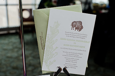
Wednesday, October 26, 2011

IN THE STUDIO // S A L E !

I am offering customers 10% off of my customizable letterpress holiday photo cards through November 6th, 2011. These cards are letterpress printed on 100% cotton card stock with choice of color, font and greeting and include white envelopes and self-adhesive, beveled photo corners. Check out the entire selection here.

Wouldn't these make a great engagement announcement or first-Holiday-as-a-married-couple card? Letterpress is a wonderful match for the artful photography that couples get for their engagements and weddings. Those photos are so special, couples want to share them and a luscious letterpress holiday card is a great way to honor the beauty of such a special time in their life together.

I have also had a number of people use these as a combination baby announcement/holiday card. At such a busy yet exciting time it is a great idea to send one card for both occasions.

These cards are especially nice for two reasons: first, they're letterpress. In a sea of canned photo cards it is so lovely to pull a hand printed piece of cotton paper out of an envelope. It's the best way to express warm wishes, I think. Secondly, and more practically (especially for engagement/wedding and baby photos), the photo is removable for use past the holidays. No more holiday cards stuck on the refrigerator taking up too much space, just the photo. And in the case of the reverse mounted cards the photos are frame size. The sender is not only sending a card but a small photo gift.

To get this great deal order at my etsy shop and then use the coupon code FACEBOOK. If you need larger quantities than what is there feel free to contact me at amy{at}armatodesign{dot}com.

Photo mounted on reverse of card.

Wallet size photo mounted on front of card.


Tuesday, October 11, 2011

IN THE STUDIO // HEARTEN


I'm so thrilled to be able to introduce to you Hearten, the online magazine of the Independent Wedding Association! This has been a pet project of mine for some time now. We started talking about it last spring, did the photo shoots this summer and wrote, designed and edited it this fall and now it's here! Take a look, won't you?

Hearten {whose tag line is "Encouragement & Ideas for your Twin Cities Wedding"} was born out of a desire to provide Twin Cities couples with education, inspiration and comfort. We wanted a magazine that was more than just pretty pictures {though there are lots of them too}. We wanted real content for couples to go to when planning their wedding from vendors who are close to what they do and LOVE what they do. So while we do have two glorious photo shoots with great ideas AND gorgeous photos, we also have features like "Glossary" which, in this issue, defines the terms used in floral design. Do you know what a pomander is? You will after you read Hearten. There are other great features in this issue that you'll have to see for yourself and there will be even more in future issues.

I will be posting more photos of the stationery I designed for the two shoots in the coming days. I hope you enjoy Hearten as much as we enjoyed putting it together and bringing it to you.


Thursday, August 4, 2011

IN THE STUDIO // RUPERT HOBBES

We had the privilege of printing business cards, letterhead and envelopes for a new company: Rupert Hobbes {they're so new, in fact, that they don't have a web site yet but here's their Facebook page. Like them, won't you?}. The design is from Jim Felgate. Did you know that if you have a design already we can print it for you? We can and we do.

"Rupert Hobbes creates heirloom quality product for the luxury handbag, attaché and small leather/personal goods market. Rupert Hobbes does not make products for everyone, but serves those who wish to own enduring design of the utmost quality."

Letterpress was a perfect choice for Rupert Hobbes and we were so happy to provide it for them. The business cards are printed in one color on Pearle Lettra 100% cotton paper in metallic gold ink. The letterhead is printed on natural white Mohawk Superfine paper with coordinating side load envelope again in metallic gold ink. What I love most about the ink is that it is a rich color and even though it is metallic it isn't garish or shiny. It just has a luster that warms everything up. Lovely.


Wednesday, July 27, 2011

IN THE STUDIO // AS SEEN IN... MINNESOTA BRIDE


There we are on page 34 of the Fall/Winter issue of Minnesota Bride! Our sunflower invitation, reply card and thank you. Oh goodness, I love seeing our designs on the glossy pages of a magazine. And check out the cover! I just love the design, the fashion, the great company we're in. Thanks so much to Minnesota Bride for continuously supporting the great wedding talent we have here.

Just in case you can't read what they had to say about us:
Flower Power
While this style and layout are predetermined, the wording, font and colors can be adapted for your celebration. At Armato Design & Press, even the printing method is customizable: choose from luxurious letterpress, mid-priced offset printing or a PDF file, allowing you to select your own printer. The sunflower design—one of designer Amy Armato’s favorites—mixes a modern mood with a nature motif, a perfect fit for a pastoral wedding setting.
Armato Design & Press, 612.387.4844, armatodesign.com

You can read more about the sunflower invitation here. And here's another feature in Minnesota Bride.

Tuesday, July 26, 2011

IN THE STUDIO // THE MINUTIAE OF LETTERPRESS

Letterpress // Makeready, Printing, Clean Up from Armato Design on Vimeo.


This time-lapse video shows our pressman, Tim, as he gets the press ready for printing, prints and cleans up. Approximately 70 minutes are collapsed into less than 3. {There is no audio.} The most interesting part of the video is noticing the small things he has to do to print these business cards. The little adjustments to the plate and the ink are all what makes the hand made result so beautiful and so "boutique".

Sunday, July 17, 2011

IN THE STUDIO // SUNFLOWER INVITATION

Introducing my new favorite invitation: The Sunflower. I especially love how it is a very modern take on a pretty rustic flower. This is a closely cropped bright yellow and chocolate brown sunflower letterpress printed on 100% cotton bright white paper with a bright yellow envelope that has a full bleed {runs off the end of the flap} cropped sunflower. Of course it can be printed in any color combination you wish {I would love to see it in a deep orange and charcoal gray}. This one was printed for Sharon's big 40th birthday blowout, but wouldn't it make a lovely invitation for a fall wedding?


Sunday, July 10, 2011

INSPIRATION FILE // REBUS SAVE THE DATE INSPIRATION

Don't you think this is a great idea for a save the date or game for your guests to play while they're waiting for dinner to be served? Customized for your event, of course. I really don't think I'll ever tire of this design style. Thanks to Steven Heller for constantly finding the best in design history, both remembered and forgotten. Here's the full post.

Monday, July 4, 2011

IN THE STUDIO // UPTOWN MODERN


It was a pleasure to work with so many creative wedding professionals (many from the IWA) on this inspiration shoot for which I did the stationery. Though not the central focus, vendors were encouraged to be as eco-friendly as possible. With this in mind I created a stationery suite that minimizes paper use and maximizes smart design. This is most evident in the invitation which is printed on both sides and is divided in the middle by a perforation. The top of the invitation has all of the pertinent information for the wedding, the bottom has a reply post card. For the back of the stationery, the top of the invitation (the piece that the guest keeps) has directions to the event, the bottom (on the back of the reply) has a return address with postage affixed. This piece does minimize paper which makes the design of the piece that much more important. Great attention was paid to the design of the invitation as a whole keeping in mind what the pieces will look like when separated.
Other paper minimizing features include signs that replace individual place cards and a sweets menu sign. Another minimalistic consideration would be a menu sign. For this shoot, however, individual menus worked better for highlighting place settings.

Thanks to Katrina Hannemann of Studio Laguna for not only organizing the shoot but for taking the gorgeous photos.
It was also wonderful working with the following talented wedding vendors:
Grace Bridal Boutique (now available at Posh Bridal)
Five Event Center
BeEvents
Sassafras Floral Design
JWP Jewelry Design
Heimie’s Haberdashery
Fabulous Catering
Jessica’s Cakes

Monday, June 13, 2011

SHOP // GARNISH


OH MY GOD! How did I just learn about Garnish? I was just paging through the newest issue of Sweet Paul {another "OMG! how did I just learn about..." moment. It seems I've been having a lot of those lately} and saw an ad for Garnish. Oh, it's so nice to have a place to go to for simple but unique {not to mention customizable: Letterpress labels and/or tags anyone?} packaging options. A cupcake in a mini-coffee-to-go-cup? Sold! Lovely wooden spoons for a lovely paper cup full of gelato? Sign me up! Wedding favors that look so cute your guests won't want to open them? Done, done and DONE!

Ok, now I have to get to planning my next gathering so I can order from Garnish. I can't believe I've gone this long without them.

Wednesday, April 20, 2011

INSPIRATION FILE // COLOR BOARD

I can't get over these colors. Unique beyond words, so luscious. Not at all "cookie cutter". The girls over at 100 Layer Cake are color geniuses, that has been clear to me for a long time, but this color board is just... Oh. My. God. So inspiring.

Wednesday, April 6, 2011

IN THE KNOW // GUTENBURG MEETS GOOGLE

This may be a little type-nerdy but you shouldn't trust a designer if he or she isn't a type nerd. That's just a little advice from me to you.

Anyway, Open Book's Family Days event series presents Gutenburg meets Google: the future of the book in a digital age. This will be an afternoon filled with poetry, speakers, activities, and film. There will be hands-on family-friendly bookmaking/printmaking workshops in the Minnesota Center for Book Arts studios, readings by local poets in the Target Performance Hall, presentations by Paper Darts Literary Magazine and MCBA staff, panel discussions with editors from Lowbrow Press and Milkweed Editions, and a screening of Typeface with a Q&A session afterwards with Director and Producer Justine Nagan. The event will run from 11:30 to 4:30 pm. It is free and open to the public. The finalized event schedule can be found at Open Book's website.

For me the most notable event for this series is the presentation of the documentary Typeface. It is about the Hamilton Woodtype Museum in Two Rivers, Wisconsin. From the film's web site:

Typeface focuses on a rural Midwestern museum and print shop where international artists meet retired craftsmen and together navigate the convergence of modern design and traditional technique.

It is on my graphic design "bucket list" to visit the Hamilton. Until then I have a good feeling that this film will inspire me.

IN THE STUDIO // MADDIEBIRD BAKERY


It was so great working with Michele McAtee to come up with a logo for her new business. One that describes the nature of her work and one that will grow with her as her business expands. Michele describes her work this way: "Maddiebird Bakery... [bakes] cakes from scratch and custom-decorates each cake to be an original work of art...delicious, delicious art." Michele wanted something that was both folksy and young looking. I think she got it and I can't wait to see what she does with it. More to come...

Tuesday, March 29, 2011

INSPIRATION FILE: RED AND WHITE AND FANTASTIC

Just like whenever summer rolls around I wonder why I never entertained the idea of teaching as a career, when I see photos like these I wonder why I never entertained the idea of moving to New York City. This satellite exhibition of the National Folk Art Museum at the Park Avenue Armory is positively inspired in both its subject and it's presentation. It's a wonderland of red and white quilts called “Infinite Variety: Three Centuries of Red and White Quilts". Thanks to Steven Heller's blog The Daily Heller for covering it.

Oh, the invitation ideas that are circling in my head right now.


Tuesday, March 8, 2011

INSPIRATION FILE // ONLINE WEDDING MAGAZINES

Today I'm designing and designing new wedding invitations for ADP's customizable wedding invitations line called Wedding Papers. Part of my process is seeing what else is out there from the big names in weddings, but also the smaller names who may not have as loud a voice but still have lots to say. I guarantee that you're more likely to see true innovation from the small guys. Anyway, I've been very inspired by three e-magazines: Nonpareil, Utterly Engaged and Style Me Pretty's E-Glossy. The cover story on Nonpareil for this issue was designed by a few Independent Wedding Association members: Red Ribbon Studio, Just Bloomed, Cocoa & Fig and Paperista. Nice work girls.

As a quick side note: I'm loving Issuu, the publication tool used by all three of these magazines. As a print girl I love the ritual of sitting with a new publication, flipping through its pages and enjoying the spreads and stories in a designed layout. Blogs are great but you just don't get that same feeling of being told a story from them because you scroll, you don't get to flip. If we can't flip through the actual pages of a mag, at least Issuu is letting us flip through virtual ones. Of course now all I want to do is design a wedding magazine myself. But invitation design is pretty fun so I'll stick with it today. Happy Tuesday to all!


Thursday, March 3, 2011

IN THE STUDIO // BABY GIRL BIRTH ANNOUNCEMENT

We just finished printing this birth announcement for the newest member of the Pearson family. It is letterpress printed on 100% cotton paper in pale pink ink and comes with 4 old fashioned looking {but adhesive backed} photo corners per card so a full size picture can be mounted on the back of the piece. This way the photo can be removed for framing and there is no writing or additional design on it, just the sweet, little new face. Go to our Etsy shop for more information.

The photo above is the piece on press. Notice the inked photopolymer printing plate in the background as well as the rollers and ink plate. The photo below was taken right after the plate was set up with the right impression. It's printed with no ink, just pressure. Nice.

Friday, February 25, 2011

IN THE STUDIO // STYLE SHOT NUMBER 4


Here is the final styled shot Erica Loeks and I designed for an upcoming marketing project I'm doing. Read more about this invitation here.

A great big THANK YOU to Erica for her photographic talent. This was a long shoot but it was so fun because Erica is a great person to spend time with. If you're in need of a thoughtful, creative and upbeat photographer for your wedding or any event give her a call.

IN THE STUDIO // STYLE SHOT NUMBER 3

Here's the third of four style shots Erica Loeks and I did for an upcoming marketing project I'm putting together for Armato Design & Press. Read more about the invitation here.

IN THE STUDIO // STYLE SHOT NUMBER 2

Here's the second styled shot that Erica Loeks and I designed. The goal with this invitation was to make ginkgo leaves look winter-y. Mission accomplished. Charcoal gray will do that pretty well and the violet color is just cool enough without being predictable {a.k.a. blue}. Go here to read more about the invitation.

Thursday, February 24, 2011

IN THE STUDIO // SOMETHING NEW WEDDING FAIR RECAP

The Something New Wedding Fair was a great success. Here's the link to see all the great vendors of the fair. And hey, why not "like" the IWA on Facebook while you're at it. You'll be kept in the know about what's going on in the Twin Cities wedding community with weekly round ups and information on upcoming shows and events. Go to the Armato Design & Press web site to see full descriptions of the invitations pictured above and below.

A HUGE thank you to Sarah McGee Photography for shooting the event AND making the images available to vendors. It's important work and it's great that it's done by such a pro!